Amrit Chocolates
A luxury chocolate brand conceptualised and crafted from scratch. Each bite is meant to be an experience, come savour it.
Branding, Logo, Packaging Design

Project Overview
Industry: Luxury Foods
Year: April 2025
Scope of work: Research, Brand Strategy, Brand Identity, Logo, Packaging, Ad Design
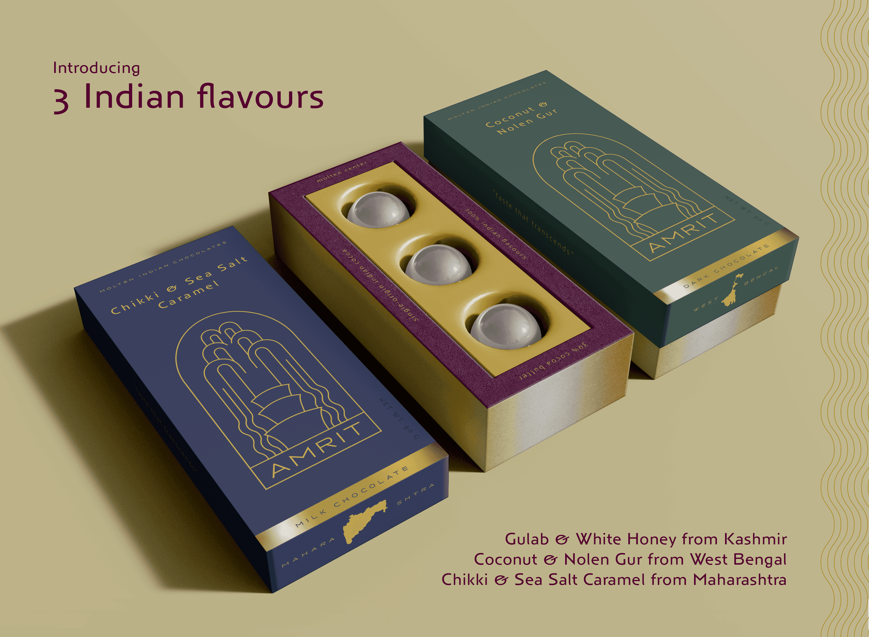
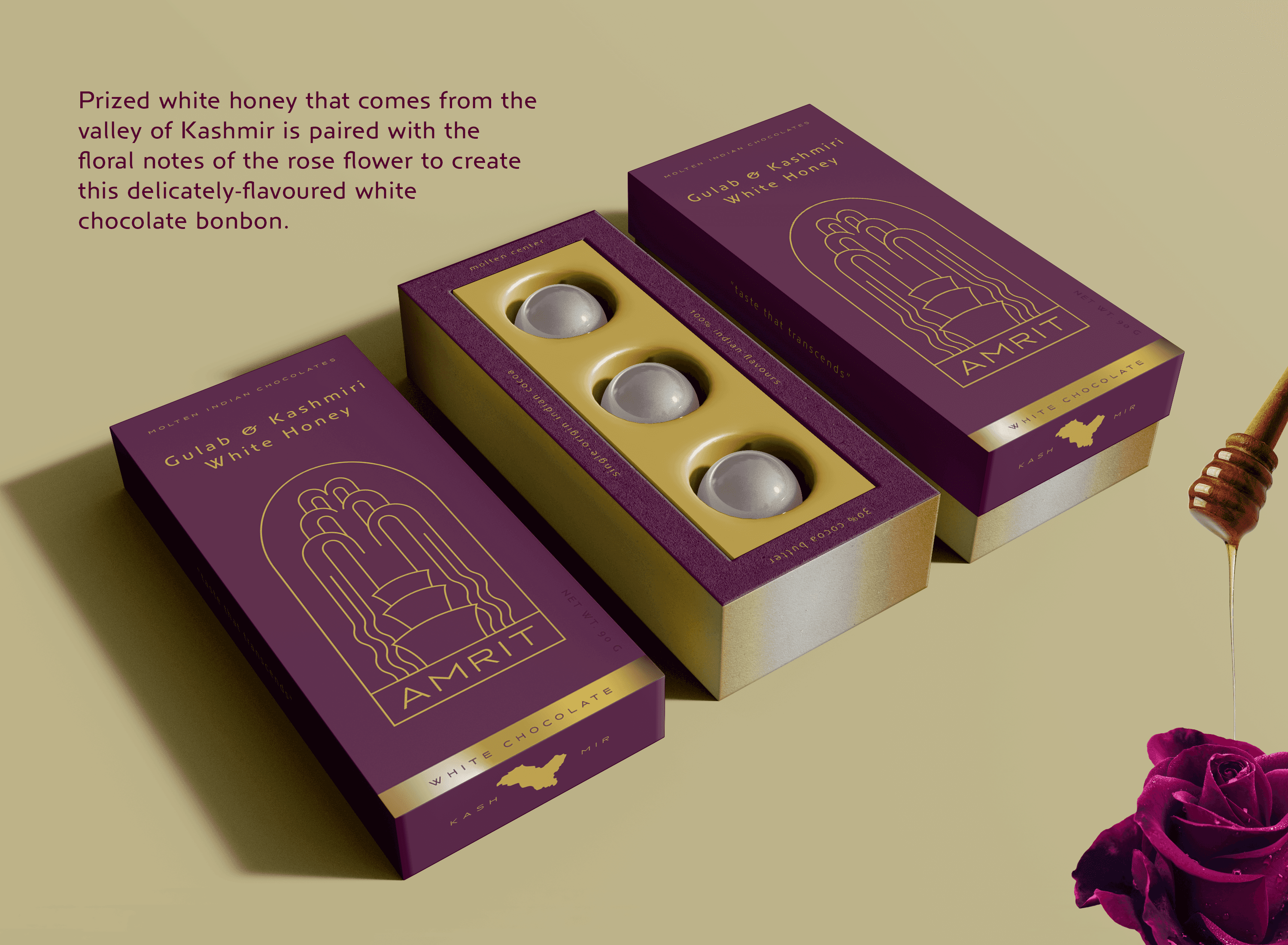
Amrit was conceptualised as a luxury chocolate brand for the refined yet modern Indian palette. It celebrates regional flavours from across India in the form of bonbons with a molten liquid center. Amrit is not just a chocolate; it's an experience, it’s India in a bite.

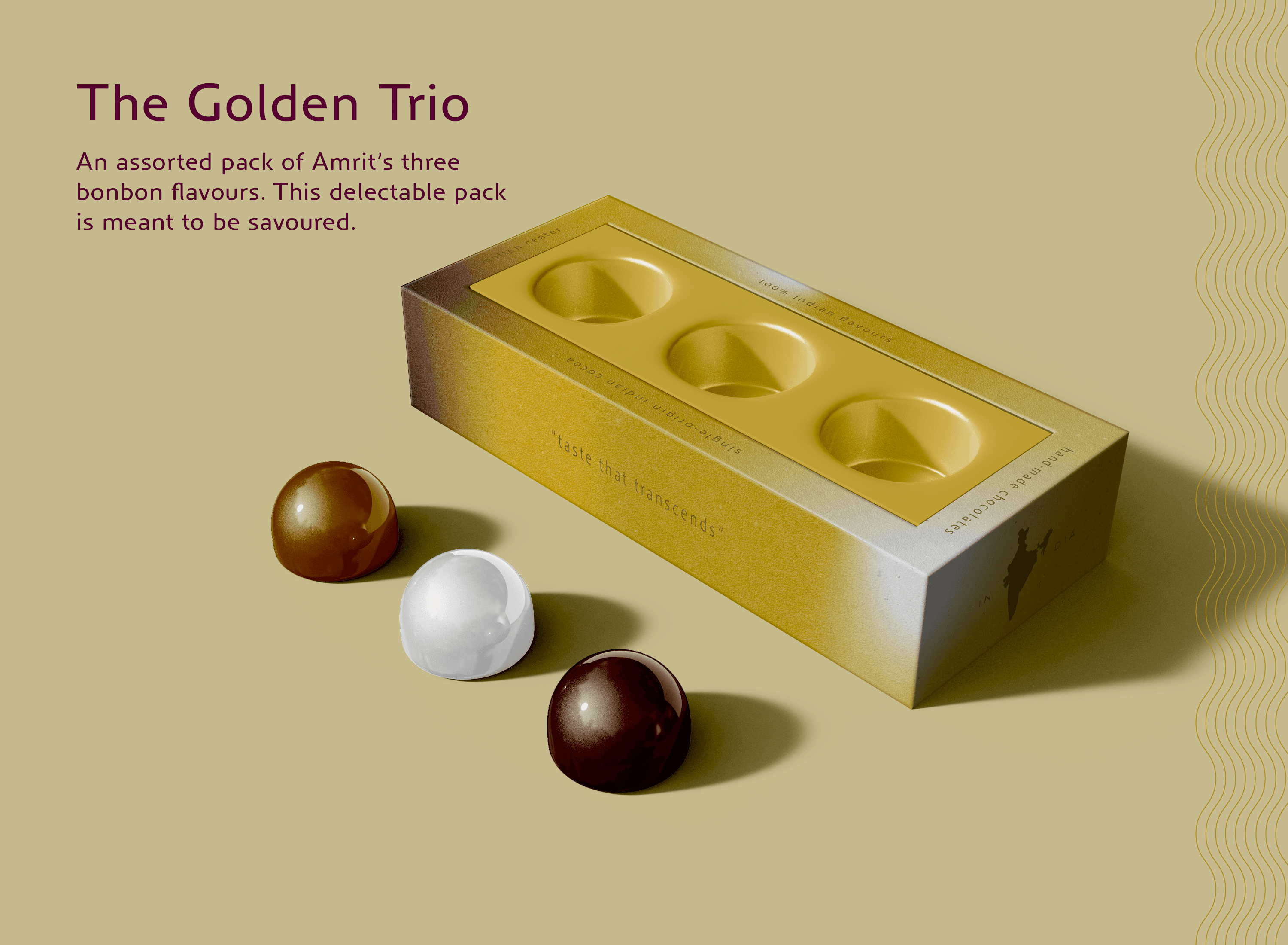
Amrit is inspired by the Samudra Manthana or the Churning of the Ocean in the Vishnu Purana, where gods sought the nectar of immortality. Every bonbon carries the essence of an eternal drink with its molten center, a tribute to the legendary elixirs that promised vitality and delight. Infused with the rarest Indian flavors, these chocolates make use of the highest grade single origin cocoa sourced from India.
The Result
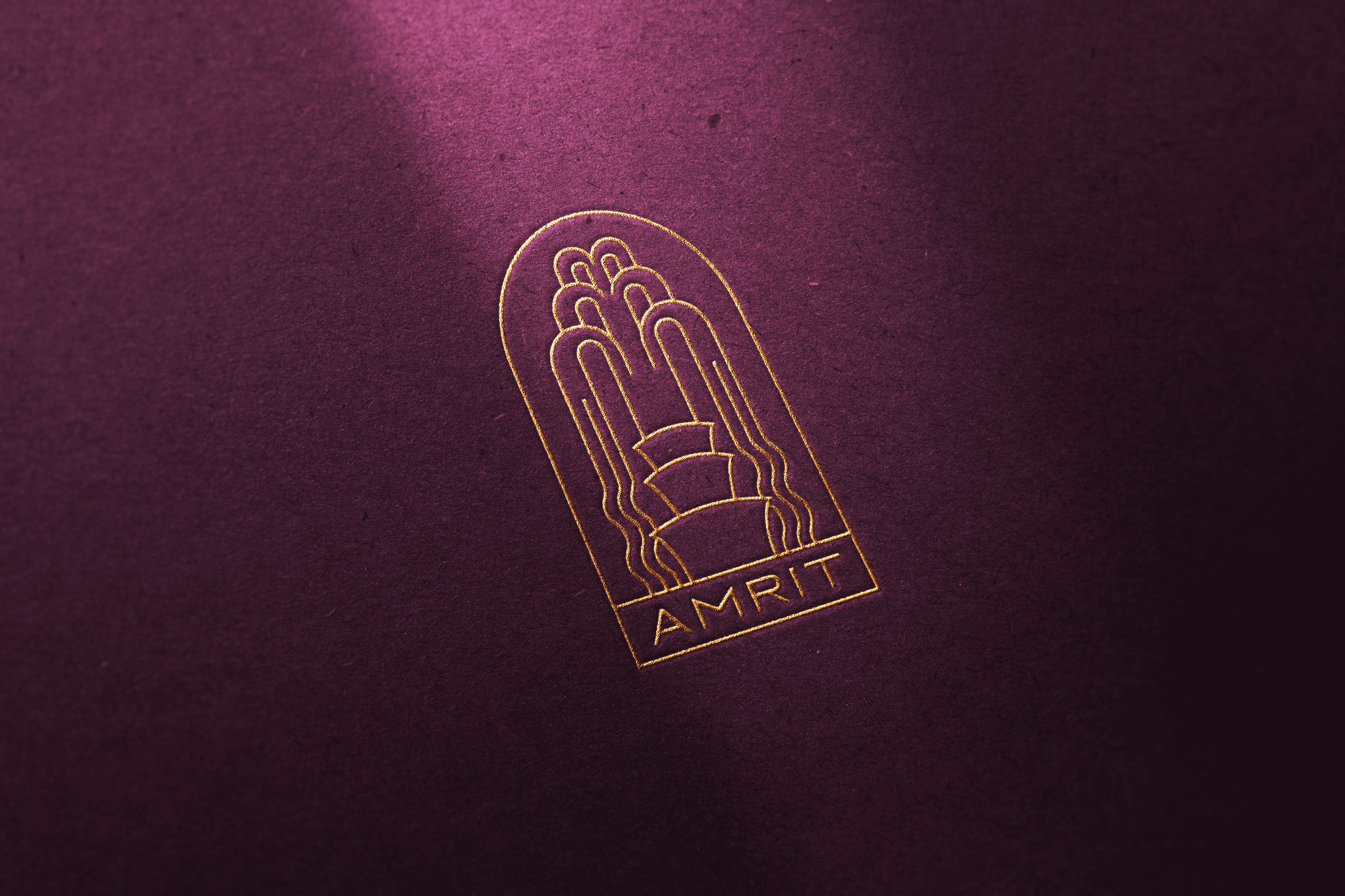
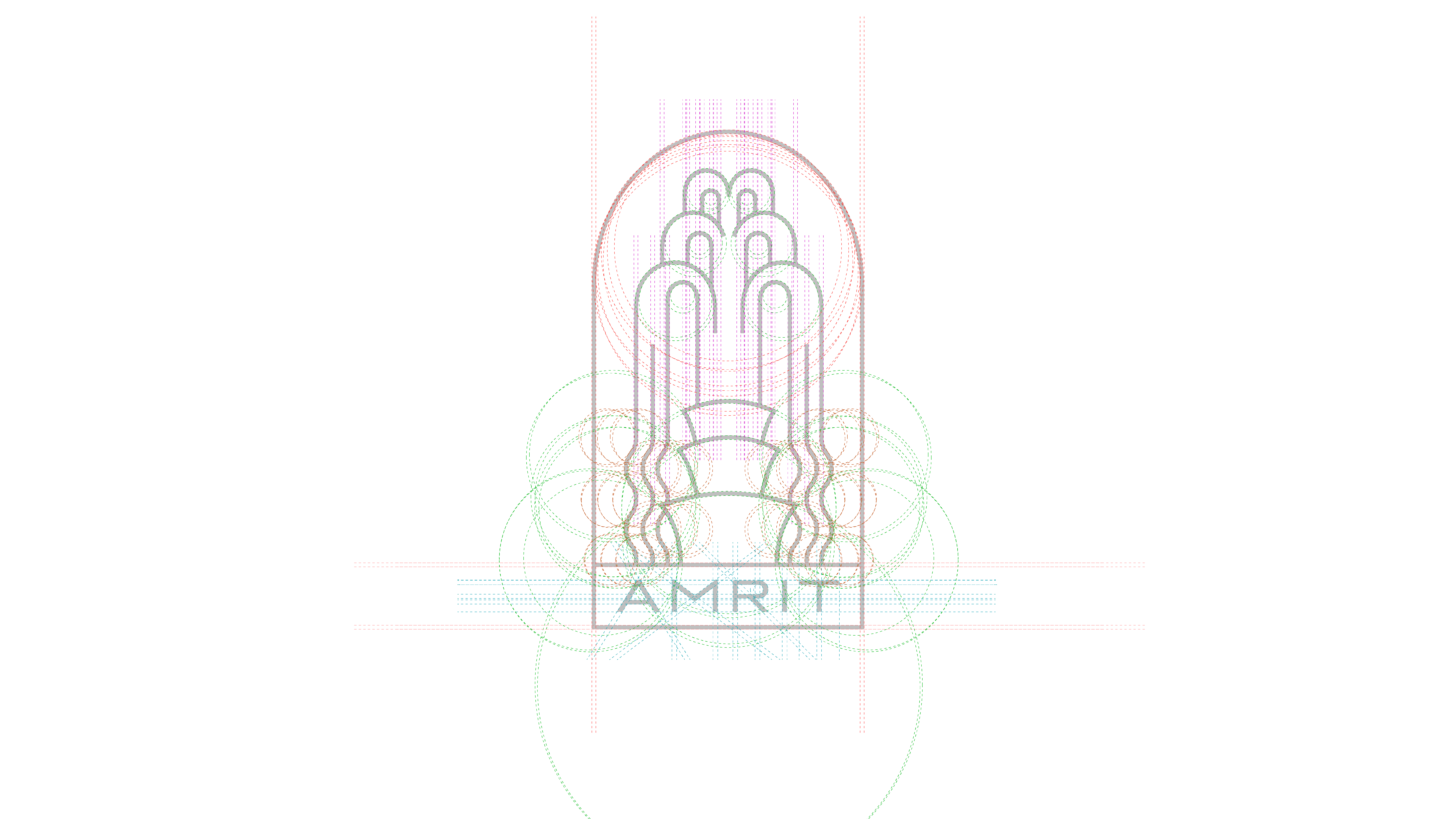
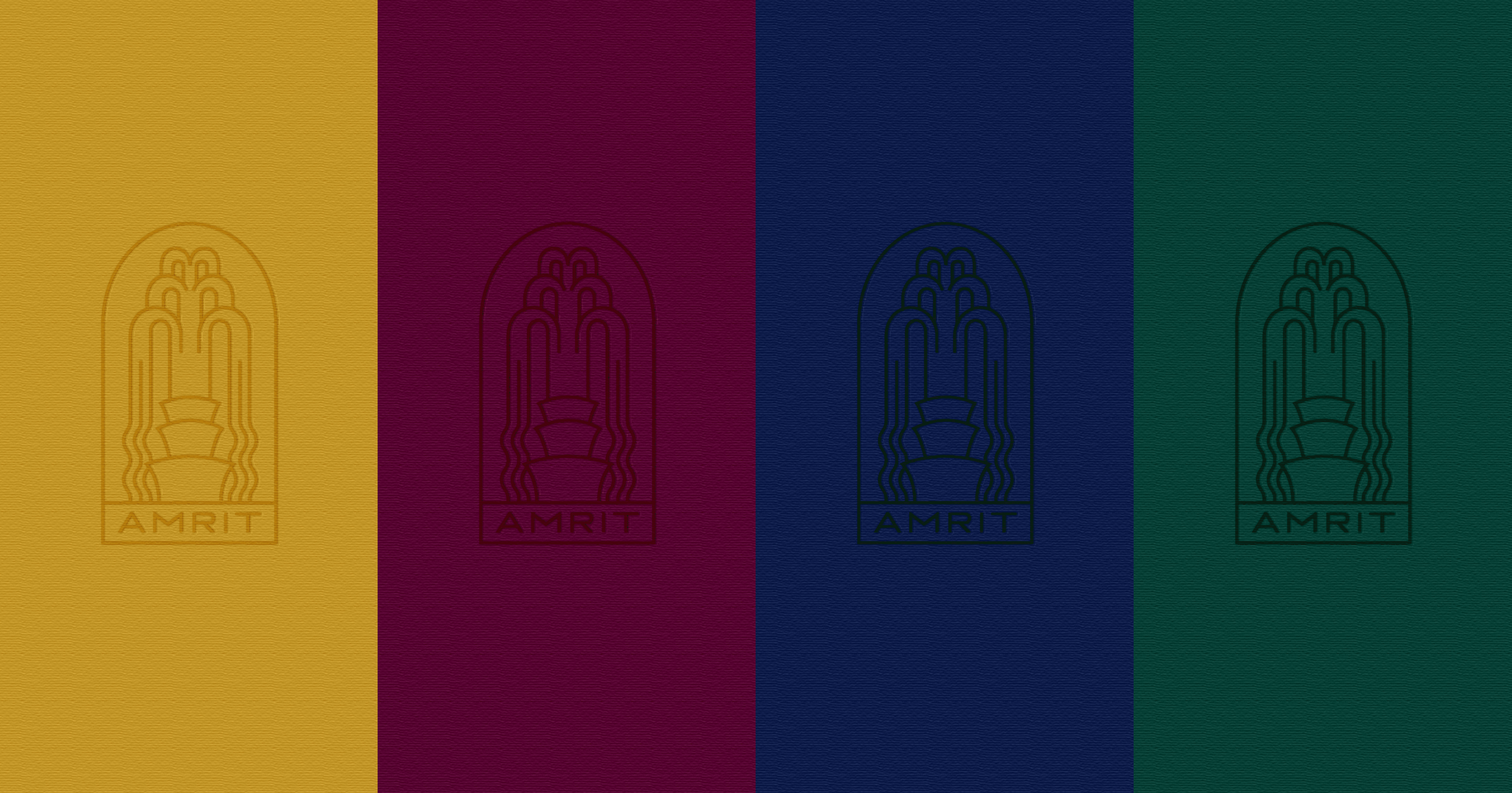
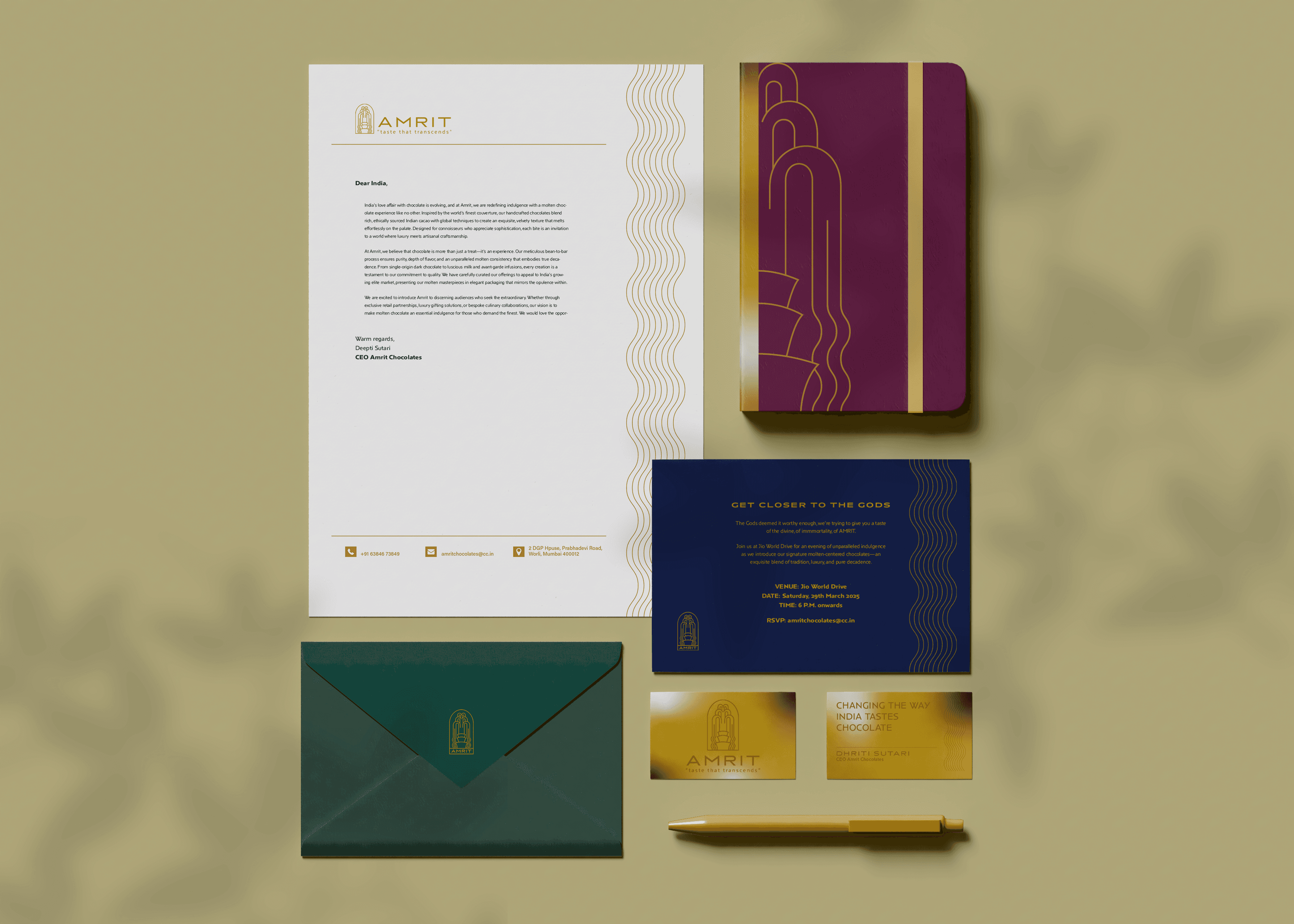
The storytelling of Amrit has been balanced with sleek, luxurious packaging that goes big on rich textures and materials. The logo and identity is inspired by the Art Deco movement and uses the fountain to symbolise amrit, the molten center.

The Challenge
Minimalistic-looking luxury products have inundated the market, and minimalistic logos especially. I chose to prioritise materials and textures with the packaging to add that refined touch. In stead, the logo here is sleek, yet detailed and unabashedly Art Deco. The colour palette combines jewel tones with golds
